top of page
Redesign Project
The redesign that modernized 40+ publications — and the system that made it stick across a distributed team.
More Info
The Problem
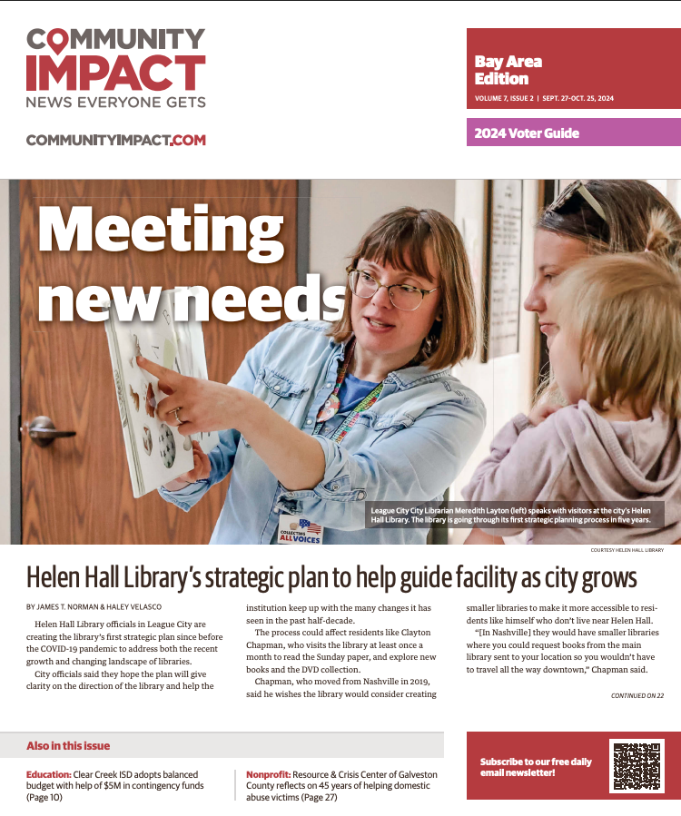
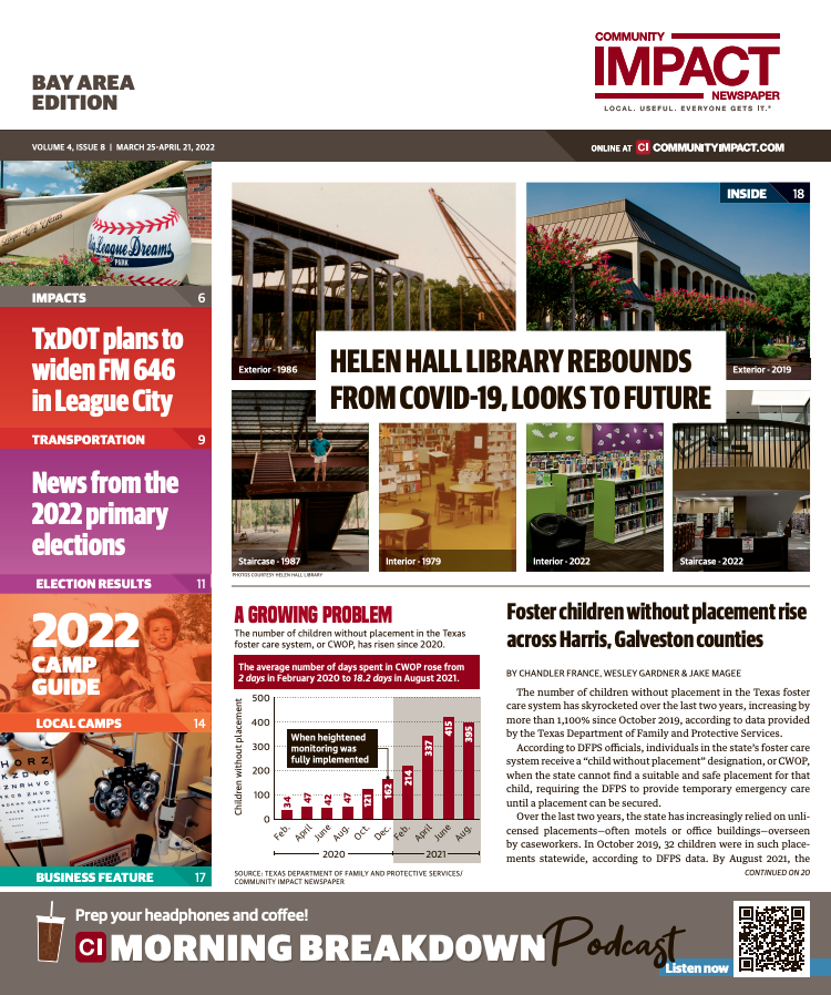
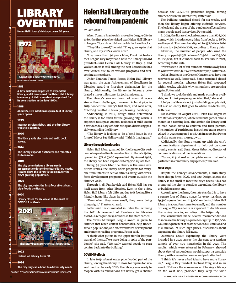
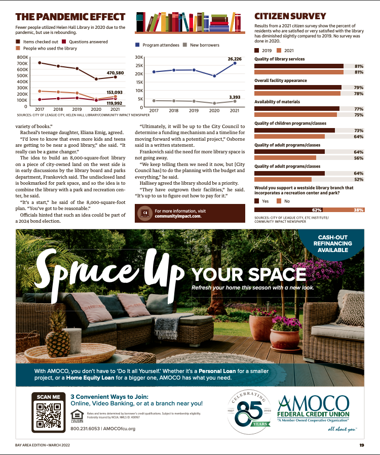
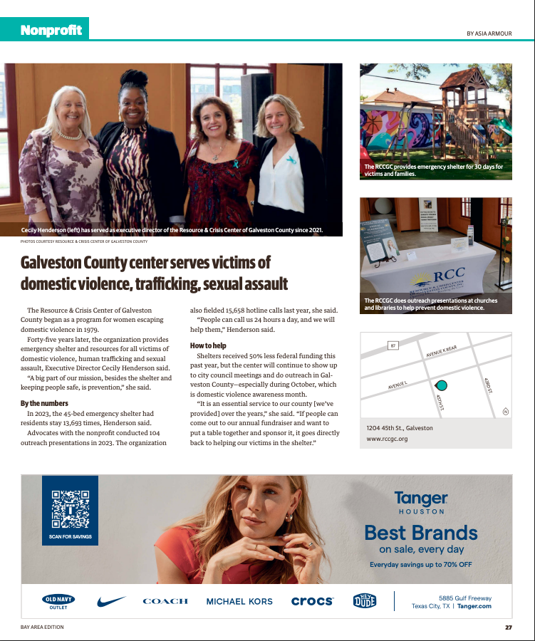
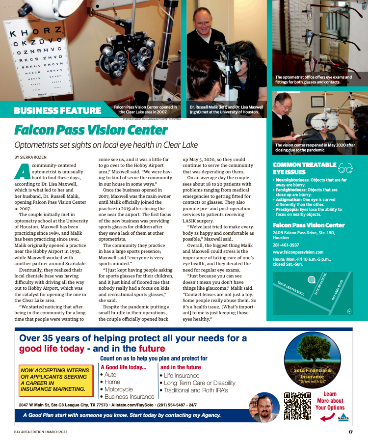
Community Impact's print publications had served readers well for years, but the design had aged. Pages felt cluttered and dated, and the visual system wasn't doing justice to the quality of the journalism inside. With 40+ publications across multiple markets and dozens of designers executing independently, inconsistency had also crept in. A refresh wasn't just about aesthetics — it needed to be systematic enough to actually hold at scale.
What I Built
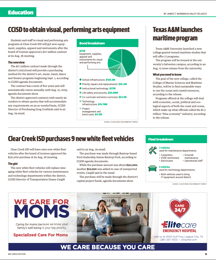
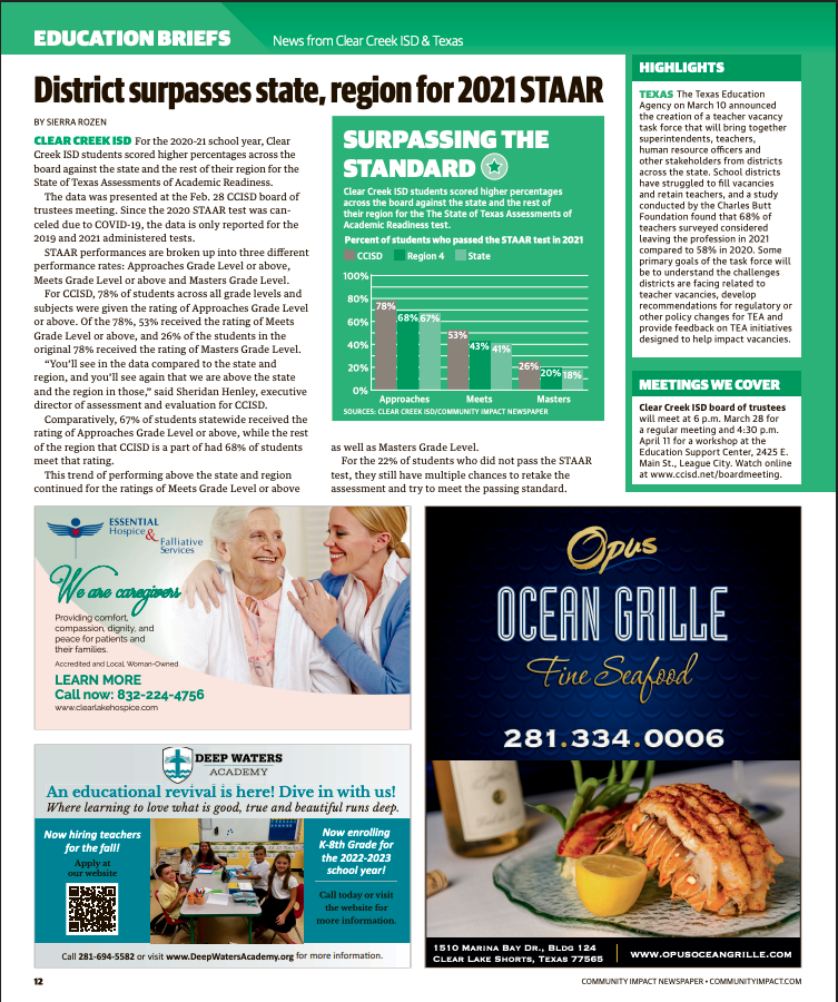
I led the full redesign from concept to rollout — new masthead, cover system, section architecture, typography hierarchy, and data visualization standards — in collaboration with an editorial task force and with sign-off from key stakeholders across the organization. The design work was mine. So was the communication and training strategy that got 40+ publications actually using it. That meant documentation, cross-functional training, and the internal rollout communications that brought a distributed team along without losing anyone.
What Changed
The publications looked like what they were — serious, community-focused journalism — instead of something that had been designed in a different era. Design department costs dropped 25% as the new system created efficiencies across the team. And because the rollout was built around adoption, not just delivery, the standards held.

01
Redesign Project

01
New Cover

02
Old cover

03
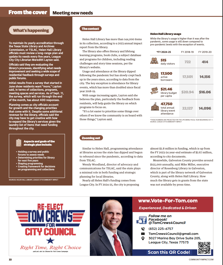
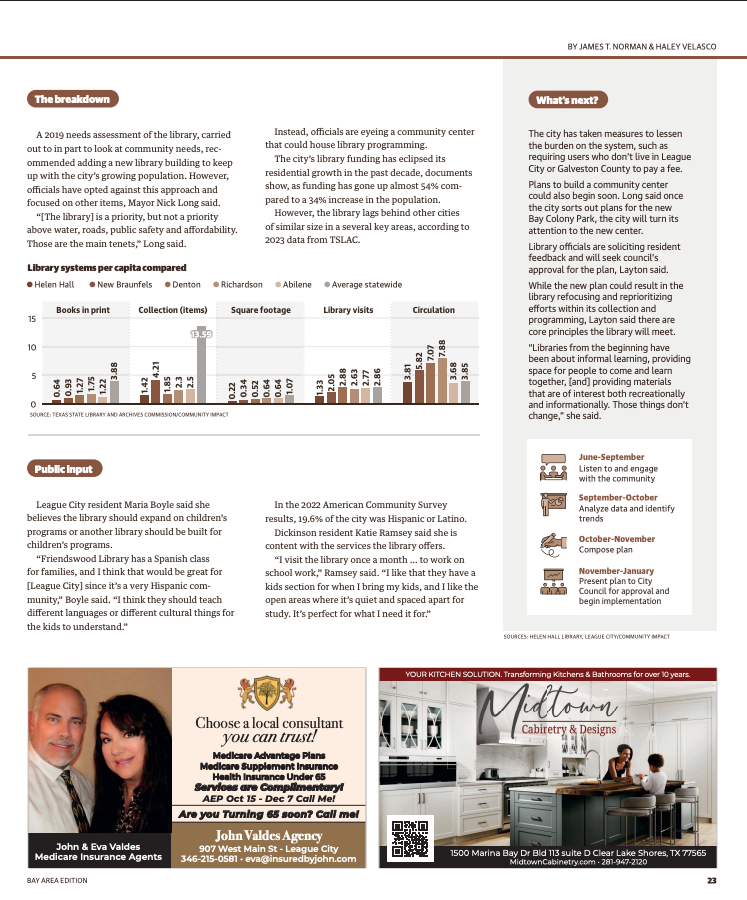
New cover story (1/2)

04
New cover story (1/2)

05
Old cover story (1/2)

06
Old cover story (2/2)

07
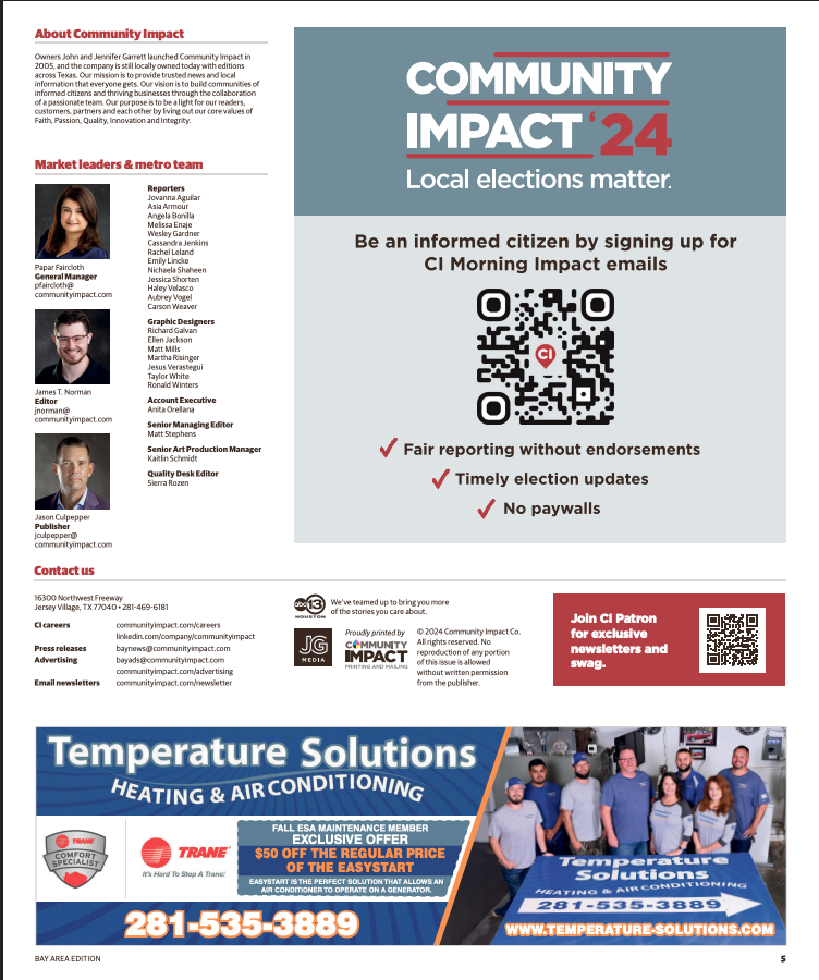
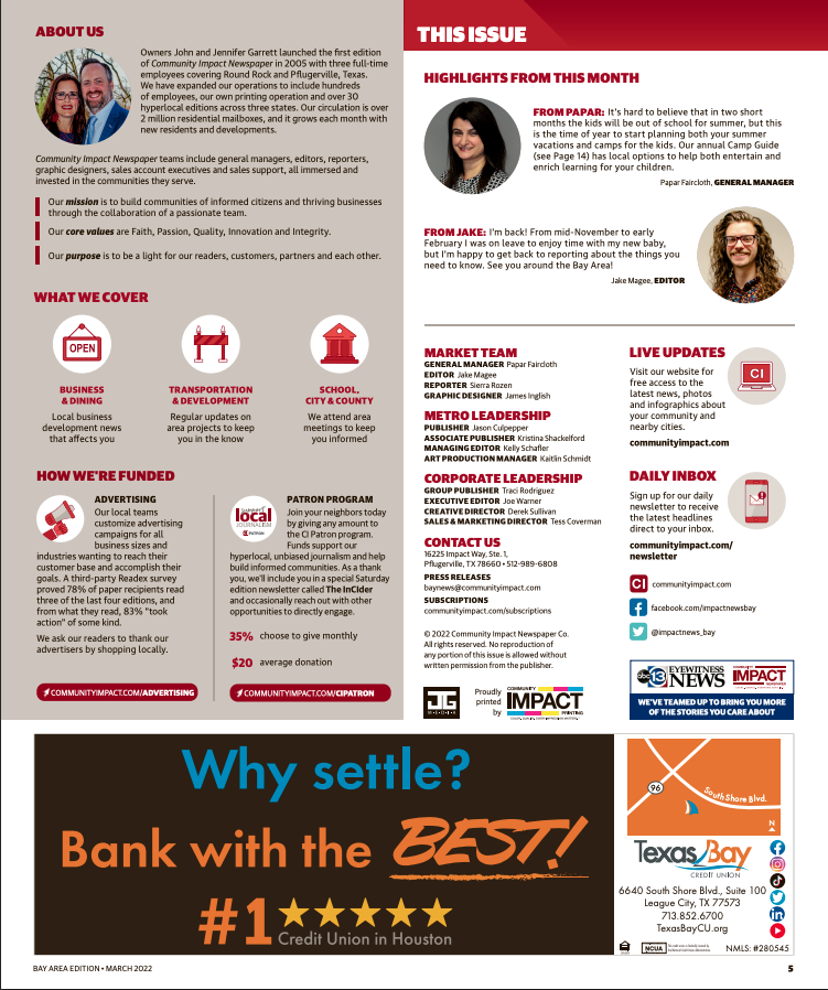
New masthead

08
Old masthead

09
New feature

10
Old feature

11
New Education coverage

12
Old Education coverage

13
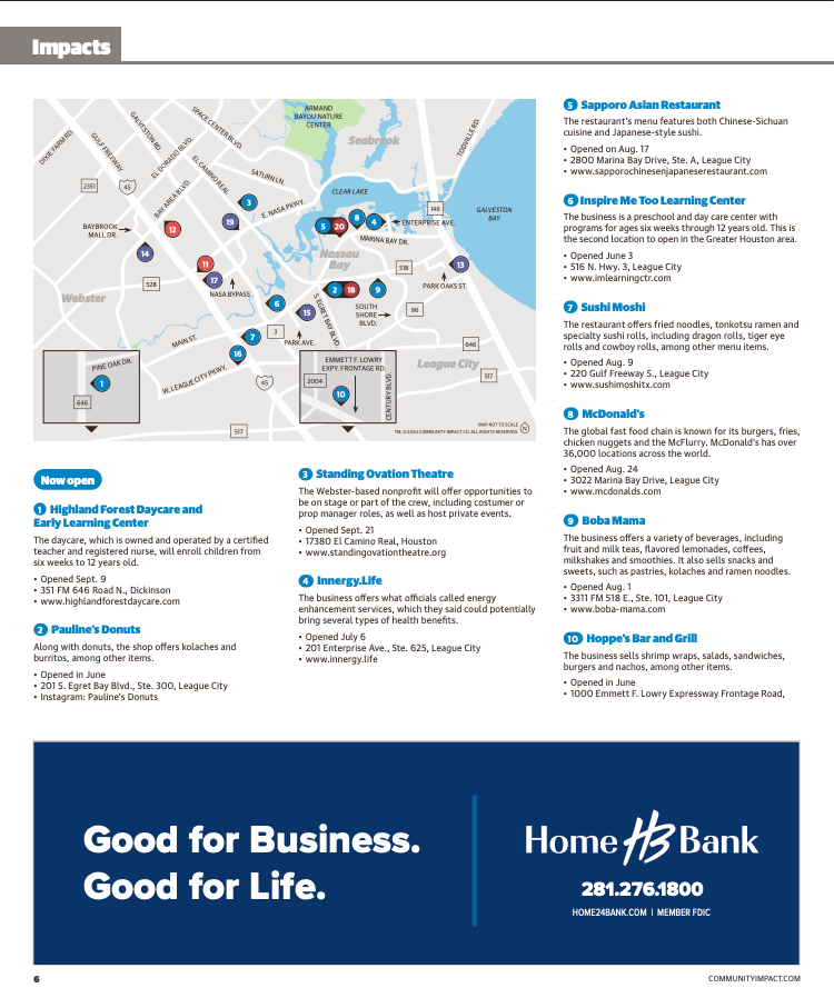
New Impacts

14
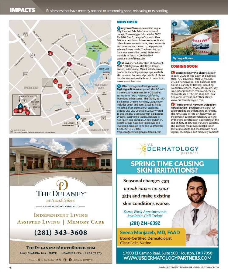
Old Impacts

15
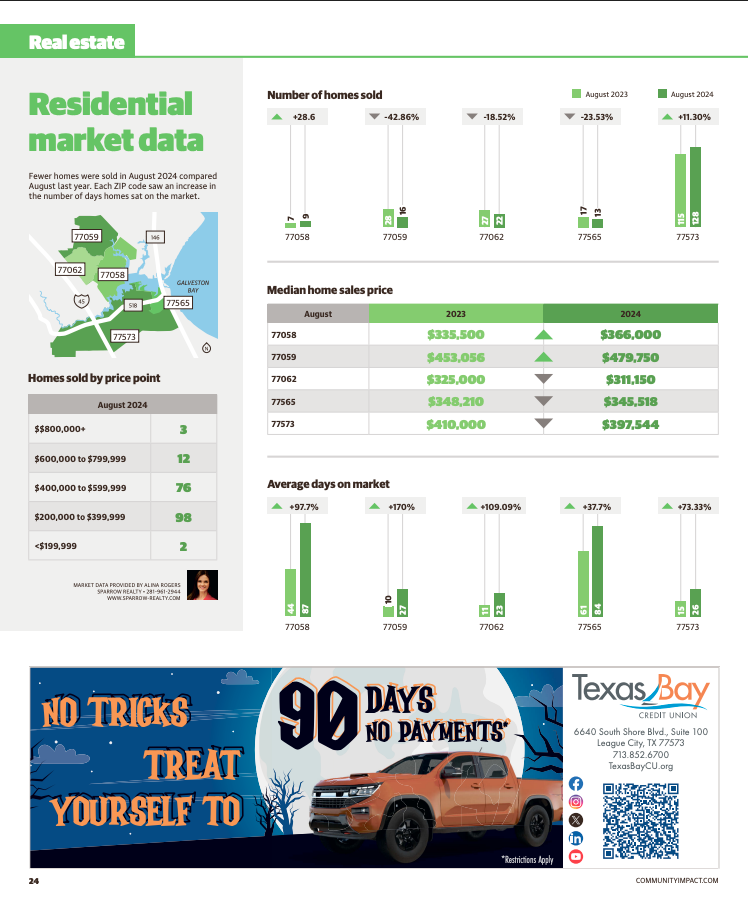
New Real Estate coverage

16
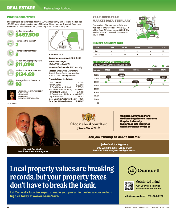
Old Real Estate coverage
bottom of page